Marketing Architects Distinctive Assets
Define and deploy two distinctive assets using research from the Ehrenberg-Bass Institute of Marketing Science.
Marketing Architects, 2024
Art direction, research, project management, design
When we began this OKR, we expected to simply solidify our already-existing brand assets, without making edits. As we worked through our research, however, it became apparent it was time for change. The company is ready for category fame, and we had the opportunity to future-proof our brand.
We combined the institute’s research with our own systems and beliefs, ultimately deciding to update our logo and color palette. We chose these based on discussions around fame and uniqueness, potential for mental and physical availability, as well as long-term creative potential. Being a small team, we also weighted choices that offered high speed and efficiency.
Throughout the length of this project, I was challenged with selling the idea internally, as well as limited time and personnel. From my manager, to the CEO, to the board this was an opportunity to excel at storytelling and emotion in creative presentations. To flow with resource limitations, I prioritized design that felt realistic, prioritizing bang-for-your-buck ideas.
RESULTS:
Early results show +4% aided awareness and +2% consideration, with full results slated for review EOY 2025.
The new distinctive assets
LOGO, BEFORE + AFTER:
Strategic logo updates:
Color Swap. The colors of our old logo were similar to several brands in our competitive set, reducing asset uniqueness.
Mobius is Hero. Although the mobius had reduced uniqueness within our competitive set, we wanted to honor our historical roots. We also believe it has an earned level of brand fame and recognition we want to retain.
“G” with personality. We believe our unique “g” has earned a level of brand fame and uniqueness, so we wanted to retain use of unique typography.
Design refined. We also wanted to address several design decisions unrelated to the distinctive assets process. For example, reading flow, balance, and the personality of our mobius and typography.
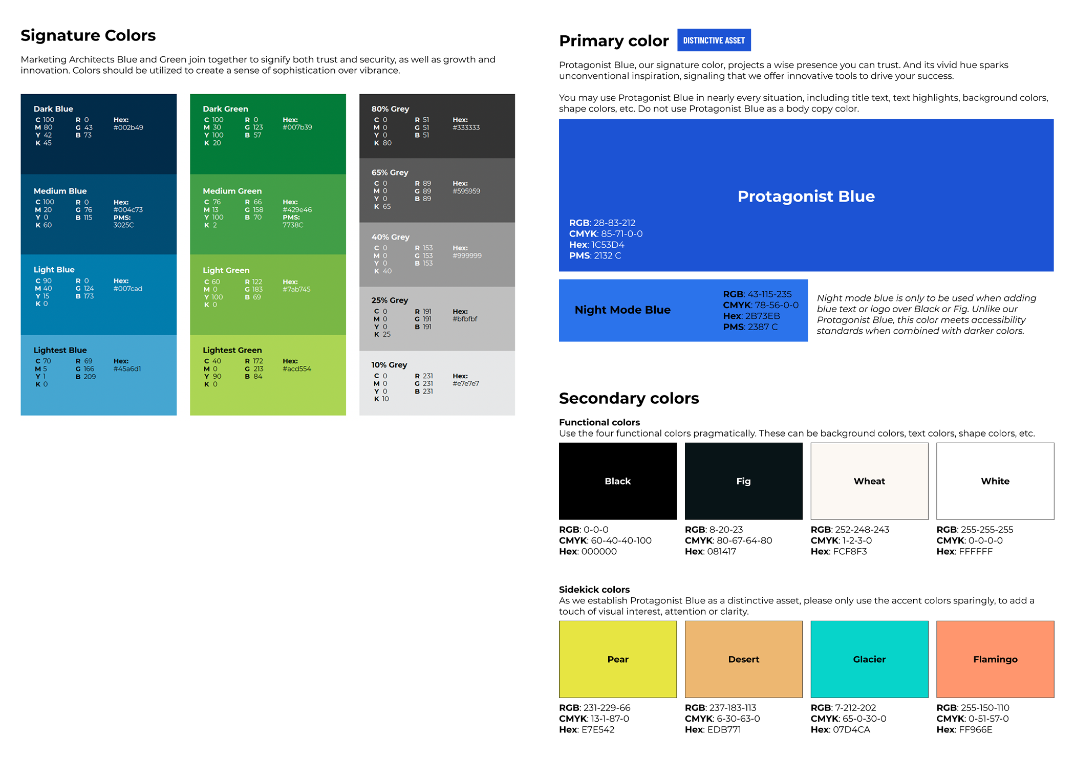
COLOR PALETTE, BEFORE + AFTER
Strategic color updates:
Follow the rules. While our color palette was technically a multi-color palette, we were not executing it using multi-color rules. After deepening our understanding, we realized a single-color palette would be the most efficient for us to launch.
Balance unique with traditional. We found high level of color overlap within our competitive set. At the same time, we felt compelled to honor our 25+ year tradition of using blue. We explored our competitive set and found a unique blue.
Preview of the research
Preview of the collateral
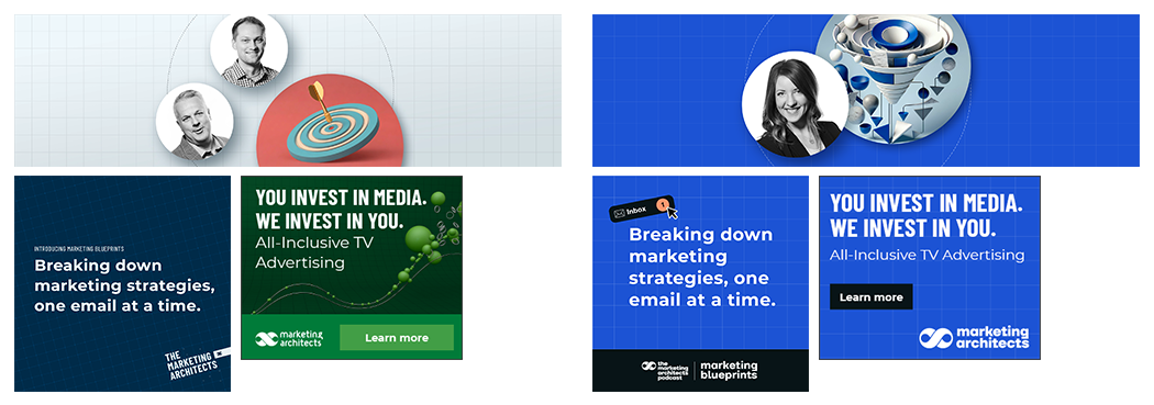
PODCAST, BEFORE + AFTER
Strategic sub-brand updates:
Tackling brand loss in sub-brands. We identified varying levels of brand loss in each of our sub-brands. To address this, we increased the flexibility of our logo execution, and flooded assets with our new, distinctive blue.
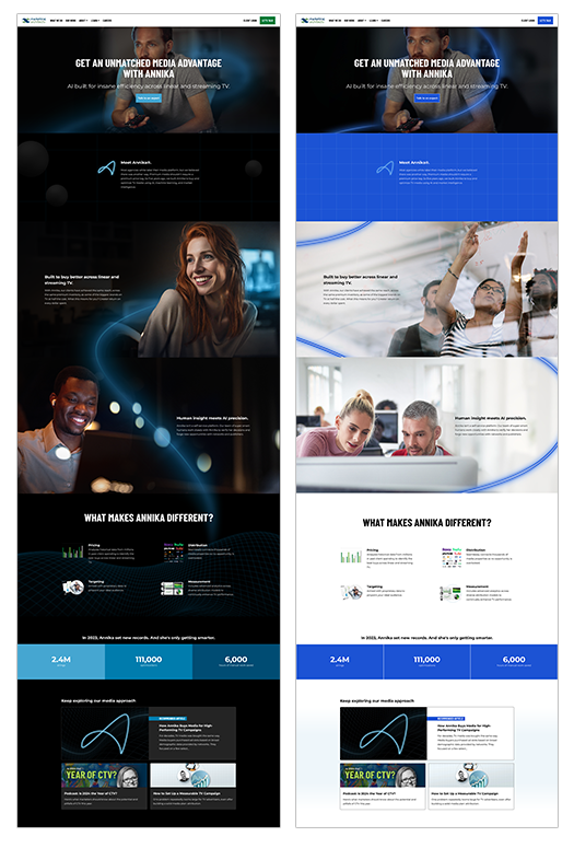
MEDIA BRAND, BEFORE + AFTER
Strategic product updates:
Tackling brand loss in products. Our media product’s all-black backdrop framed it as futuristic and tech-driven, but built memory structures around the product — Annika — instead of the parent brand. We incorporated more white and blue to call back to the parent brand instead.
Parent brand, meet dark mode. Annika’s dark color scheme was already woven into our assets. We also appreciated the high-tech feel of it. To improve efficiency and borrow the futuristic connotations, we introduced more blacks into the parent brand.


